Color-Palette Generator Guide: 5 Best Ways to Build Your Brand Fast
Building a brand identity from scratch can feel overwhelming — especially when it comes to picking colors that work together and reflect your brand's personality.
A color palette generator takes the guesswork out of the process, giving you a cohesive set of colors in seconds instead of hours.
In this guide, we'll cover 5 best ways to use a color palette generator to build your brand fast.
What Is a Color-Palette Generator?
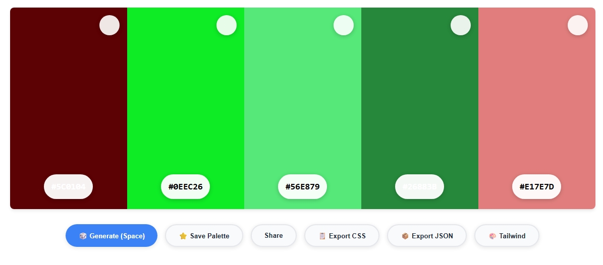
A color palette generator is a tool that automatically creates a set of complementary, harmonious colors based on one starting shade, an uploaded image, or a chosen mood.
Instead of manually testing color combinations one by one, a color palette generator gives you several ready-to-use options instantly, saving significant time during brand development.
Startups, freelancers, and marketing teams commonly use a color palette generator to move quickly from "we need brand colors" to a finished, presentable palette within minutes.
2. Generate Palettes From an Image or Logo
If you already have a logo or a reference image with colors you love, upload it into a color palette generator to extract a matching palette directly from the visual.
This is a fast way to keep new marketing materials consistent with an existing logo or product photography, using our Image Color Picker as the first step.
3. Use Harmony Rules for Automatic Suggestions
Behind the scenes, most color palette generator tools apply color theory rules — complementary, analogous, or triadic combinations — to suggest shades that work well together.
Understanding these harmony rules from our Color Wheel guide helps you choose the right palette style for your brand's tone.
4. Save Multiple Palette Variations to Compare
Don't settle on the first palette a color palette generator shows you. Generate 3-5 variations, save each one, and compare them side by side — ideally showing them to teammates or clients before committing.
This step catches issues early, before a palette gets baked into a full brand guide.
5. Test Your Palette for Accessibility Before Launch
A beautiful palette from a color palette generator can still fail basic accessibility standards once applied to real text and backgrounds.
Before finalizing your brand colors, run key combinations through a Contrast Checker to confirm they meet WCAG contrast requirements for readability.
Common Color Palette Generator Mistakes to Avoid
- Picking too many colors: Most strong brand palettes use only 3-5 colors total — more than that often looks inconsistent across materials.
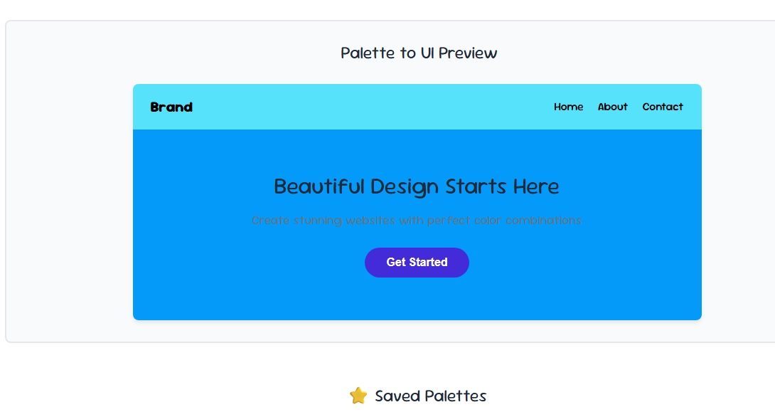
- Ignoring how colors look at scale: A palette that looks great as small swatches may feel overwhelming across a full webpage — always preview at real size.
- Skipping colorblind testing: Certain palette combinations are difficult to distinguish for colorblind users — verify with a colorblind simulator before finalizing.
- Not documenting exact codes: Save the precise HEX values from your color palette generator so your team stays consistent across every platform and material.
Final Thoughts
A color palette generator turns one of the most time-consuming parts of branding into a quick, guided process.
Whether you start from a single color, a logo, or a mood image, these 5 methods will help you build a professional, cohesive brand palette fast — just remember to test your final choices for accessibility before launch.